Wednesday, February 5, 2014

Church of Santo Volto by Mario Botta Architetto

   
Church of Santo Volto © Flickr- username: iJuliAn

Church of Santo Volto © Flickr- username: pietroizzo

Church of Santo Volto © Flickr- username: iJuliAn
    In commissioning the Church of Santo Volto in Turin , His Eminence Cardinal Severino Poletto was well aware of the reasons, risks and hopes that a church can elicit today in its particular relation with the city. Like many other European cities, Turin has focused over the past several decades on the image of its historical layout, while new urbanisation work has rarely managed to become an active part of the city texture. The opportunity to design a new church recalls the great hopes of the past, “when the cathedral were white” – to borrow from Le Corbusier. Consequently, a new ecclesial structure to replace abandoned industrial areas has become an important commitment to link different urban districts and establish a new hub for both social and religious life. Because of its position, clearly visible from Piazza Piero della Francesca, the new church engenders a monumental layout. It is a powerfully plastic symbol that draws the visitor’s attention towards a centripetal space, and its presence will indubitably become a landmark for the environs. At the same time, it is a sign alluding to the commitment to construct the city through its most significant monuments, creating an image that can bear positive witness while also reflecting the contradictory nature of contemporary life. Its design plies today’s language, yet it seeks grounds for self-expression in the history of church architecture. Indeed, this is the architect’s challenge, and it must be acknowledged as hope in that need for spirituality which sustains our daily actions. The challenge is to ensure that the emotions evoked by the Church of Santo Volto in Turin will not remain the legacy of the architect alone, but that they will instead also be shared by the Turin community, for the architect’s prime role is to interpret the hopes of the era in which he lives.
                                                     Mario Botta Architetto ( Turin, Italy, 2001-2006 )

Tuesday, February 4, 2014

Blue Residential Tower by Bernard Tschumi

Blue Residential Tower © Flickr- username: wallyg
Blue Residential Tower © Flickr- username: Scott Beale

Blue Residential Tower © Flickr- username: watz

Blue Residential Tower © Flickr- username: orijinal

     The building's base occupies a lot zoned for residential use and cantilevers over an existing building designated for commercial use. The slightly angled walls facing the street and rear yard artfully negotiate the varying setback rules, crossing the line between the commercial and residential zoning districts. The sloped top of the building integrates the zoning district's two sky exposure plane requirements. The cantilever over the commercial space on the southern portion of the building is also angled from base to top, thus enlarging the size of the units located on the upper floors, which have stunning views of Lower Manhattan from river to river. This strategy also maximizes the amount of allowable residential square footage. The pixelated facades reflect both the internal arrangement of spaces and the multi-faceted character of the neighborhood below.
     The building consists of 32 residences ranging from one- and two-bedroom units near the base to full-floor units with large terraces higher up, crowned by a duplex penthouse. The sloped window wall is a feature of many units. All units have full-height windows in the living and dining rooms. The apartments are outfitted with sustainable materials, including bamboo floors and wall panels, palm flooring, and river-pebble bathroom tiles. BLUE also recycles unused space on top of a neighboring commercial structure as an urban garden that provides communal space for residents and guests and broad views of the Williamsburg Bridge.
                                               Cit. Bernard Tschumi Architects ( New York, 2004-2007 )

Sunday, February 2, 2014

Guangzhou Opera House by Zaha Hadid Architects

Guangzhou Opera House © Flickr- username: Marco Capitanio

Guangzhou Opera House © Flickr- username: HeyltsWilliam
Guangzhou Opera House © Flickr- username: diametrik
"At the heart of Guangzhou's cultural sites development, a lasting, state-of-the-art monument to the new millennium overlooking the Pearl River. Its contoured profile, unique twin boulder design and approach promenade enhances urban function, opens access to the riverside and dock areas and creates a new dialogue with the emerging town."
                                                                                               Cit. Zaha Hadid Architects

Sunday, December 1, 2013

Columbia University's Lerner Hall by Bernard Tschumi

    The project which we will see is the Lerner Hall Students Center here at Columbia University by Bernard Tschumi designed in 1995 and completed in 1999. In this case we can understand some of the ideas of Bernard Tschumi. It is a challenging project because it is in the historical campus of the Columbia University designed in the late nineteen century by McKim, Mead and White.

Lerner Hall © Flickr- username: Chris Tengi
     The building had to respond to the masterplan, which is rather neoclassical and traditional, so there were certain restrictions of where the building had to be positioned, how big it had to be and more or less it had to respect the facades of the near by buildings. Every other building around it is build out of stone and bricks and that is why Bernard Tschumi also had to adapt the same materials. He had a chance to change that and to add certain transgressions of the neoclassical rules in the central section of the project.

First part of the building © Flickr- username: jonbell has no h
      As you can see the building has three parts. It has the front part, the cafeteria entrance and the lobby. It has the middle part with the ramp staircase and study spaces. And it was the back part with some offices and the auditorium of the building. The building is designed using diagrams. The architect looked at all the functions that had to be hosted in the inside and decided how to distribute them in the space using the circulation and the promenade between these spaces as a way to activate the space, as a way to connect these spaces and to create activities, or to create opportunities for the many activities that we have in this building. You can see the sophisticated design of some of the details that hold the facade which holds a suspended structure. Bernard Tschumi kept the traditional language in the front and the back of the building, a rather postmodern approach, as you can see the front has this brick column right next to the cafeteria, but it is suspended, so it tells us that it doesn't actually have much of a structural function in correspondence to its large volume and big shape. The back part is also kept with traditional materials. If we see in the other side where we have the entrance of the university you can see how the building adapts more or less the geometry and the language of the traditional buildings next to it.

Lerner Hall © Flickr- username: djupp
      The only part where the architect was able to add something different and exceptional was in the center. There he uses all the possibilities of the structure, of the new materials, of this new kind of space to design a space which is quite interesting and innovative. In this part we can see these large ramps that are in fact bridges that go from the two parts of the building. None of the bridges touches the ground. All the bridges in the facade go from the first part of the building to the back part and the entire glass facade is being suspended from these bridges.

The bridges in the middle part  © Flickr- username: fling93
     The architect developed a very unique and rather high-tech technology in the central part of the building where the glass is in fact suspended from the bridges and from these ramps that go through the entire building. The ramps themselves are in fact hanging from the top of the building with the suspenders that are in corners of the building and everything that is in between is in fact hanging from the side building. As you see when we approach the building the entire part below the building is completely free of columns so you have this rather large glass facade, curtain wall, that is not held by the structure that is on the floor but is suspended from the structure of the bridge.

  View from 2nd floor ramp © Flickr- username: tamasrepus
      The space has a big skylight at the center and during the day this big skylight let the light go all the way through the floor to the basement of the building. This is a very important social space, this is the students center so a lot of the students had offices around this space. They use it as lounges for studying , they have tables, the have sofas where they can hang out and meet with their friends. So the central space is in fact the core of the building and the most important part of it in terms of social activities. That is why is highly transparent. During the day when the light go through you can have a lot of people standing on the ramps around and studying, preparing for the classes. At night, when there are no classes in the building and not that many people, the building is transparent so we can see from the outside what is happening in the inside.
 
A view from the plaza  © Flickr- username: InSapphoWeTrust
      It is a space that interacts with the campus and between the activities that are inside the building to the people who are passing right in front of it. This is the only contemporary  building in this neoclassical context so we have a glimpse of the twentieth century when it was designed and build from this traditional and historical plaza at Columbia University.

Saturday, November 30, 2013

Hearst Tower in New York by Foster and Partners

    In this post i would like to talk about the work of the British architect Norman Foster. Foster and Partners is currently one of the most successful and prestigious architecture offices in the world. Foster started his carrier in the 1970s with some very unique and conceptually successful projects.

MIillennium Bridge © Flickr- username: Ingy The Wingy
    Later his practice grew to big international scale and has currently more than one thousand people working in many countries. Some of the projects that you may be familiar from the office are for example: The Millennium Bridge in London from the year 2000 that connects the St Paul's Cathedral and the Tate Modern Gallery and you may also know the Wembley Stadium from year 2002 in London with this large arch covering the large space underneath forming one of the largest stadiums in the world.

Wembley Stadium © Flickr- username: Martin Pettitt
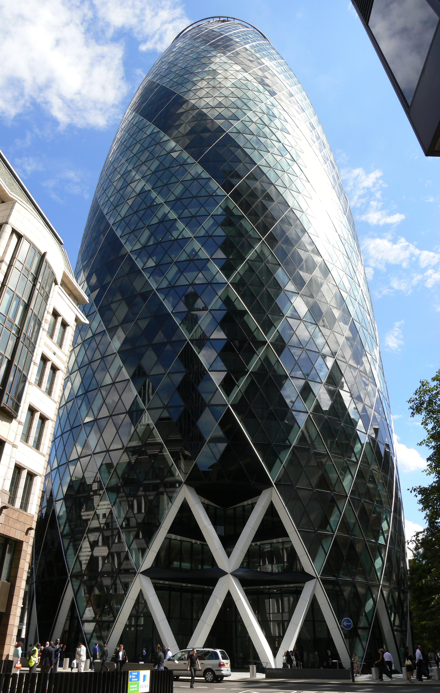
The office is well known for designing towers. One of the most successful towers the designed is the Swiss Re Tower in London from the year 2002, which is headquarters of an international insurance company. The tower is known for being very sustainable and using this air flow to pass the hot air through the building and take it out near the roof. The building uses diagrid and has oval shape and circular plan.

Swiss Re Tower  © Flickr- username: youflavio
    These idea of the diagrid was adopted by Norman Foster and his partners in a project for Hearst Tower in New York City completed in 2007. In this tower the architect uses diagrid or this diagonal structure which saves 20 percent of steel used for the building that not only makes the building more sustainable but also saves significant cost as the structure is one of the most expensive part of the building.

Hearst Tower  © Flickr- username: wallyg
The building was commissioned in the year 2001, right before the 9/11 and it was put on hold for some years after the 9/11 attacks in New York. The project for  the Hears Corporation was originally designed in 1926 in Art Deco style by Joseph Urban. The project was never completed originally, but even in the initial phases it envisioned a base with large tower above it. This is why the Landmarks Commission in New York approved the tower by Foster and Partners because it was already the idea that there would be a tower in this place.
Detail of the old facade  © Flickr- username: Antonio Viva
 The tower is located near Columbus circle on the corner of Central Park in New York City near Brodway in 8 Avenue. The project is near the Time Warner Center and also in the same avenue is the New York Times building by Renzo Piano. The differnce between this tower and the tower of Renzo Piano is that here the structure is exposed, is shown in the perimeter. Its in the same plane as the glass facade, while Renzo Piano separates and distinguishes what is the structure, what is the glass, and what are the metal rods that protect from the sun.
New York Times building  © Flickr- username: chapsRLZ
 The diagrid shape of the structure creates this unique feature in the corners of the building. Sometimes the window are facing down, sometimes the windows are facing up and they provide these unique views when one is in the interior and facing the outside. The building has some of the best views in New York City overseeing the Hudson River Park and Midtown Manhattan.
Diagrid structure of Hearst Tower  © Flickr- username: The PNG Scotts
The lobby of the building was designed by James Carpenter an architect and designer from New York City and has this waterfall which features water that go through the building and is used for evaporative cooling. The building is of the most sustainable buildings in the city: recycles its rain water, uses renewable energy and minimizes the use of air conditioning.

The Lobby of Hearst Tower  © Flickr- username:.HEI
The large lobby is an unique feature in the building, it is the place where the old building facade meets the new building. The two facades are separated and in the point of separation the architect designs a large glass facade, a big glass window in the upper part that allows the light to go through and to illuminate the public space that is right below it which is now use as a lobby and a as cafeteria.

Sliced Porosity Block II - A Conversation with Steven Holl


Friday, November 29, 2013

MIT Simmons Hall by Steven Holl

    Here we are at Simmons Hall, a building designed by Steven Holl, an architect based in New York. The building is part of a larger masterplan designed by Steven Holl for MIT which include a different educational and residential buildings. So far this is the only building build as part of this masterplan.

MIT Simmons Hall © Flickr- username: Adam Fagen
 The building hosts dorms for college students. It is inspired by the idea of porosity. Every floor has this public spaces, which are open to maybe three, four or five different levels that are accessible for students and they can use them either for studies area or for lounges where they can meet their friends.

Entrance Lobby © Flickr- username: Kyle Burrows
    Every level also has a balcony, which are these large cuts that you can see in the building, so you can either go to the indoor space of the so called caves on these very sculpture spaces in the interior, or you can on to the outdoor terrace and enjoy the views of Boston on one side or of Cambridge on the other side. Interestingly the structure of the building is in the facade so we don't have building in which he have separation of this facade and structure, but the structure itself is shown with this square grid that you see in the facade. So there are two lines of structure on the side of the corridor in the inside and then there are two structural lines right where the facade is.

Main Entrance © Flickr- username: jacqueline.poggi
     The facade is prefabricated as most of the project so the construction was easier, faster and cheaper. You can see the colours in the facade a blue, a red , orange and yellow. The colours express the structural stresses in the facade itself, so the more red we have the more structural stresses we have in that point and the more blue we have the less tension we have. So in a way its a building that shows us how it works, even if we don't see actual structures, even if we don't understand how the actual structure is designed, the colour in the facade tells us a story about it. Another interesting thing about this building is the idea of scale in the facade, as you can see is made of this square grid in which we don't really understand how many floors the building has as we look at it from the exterior. 

Mediation Room © Flickr- username: Kyle Burrows
     That idea of the scale is translated to into a different building by Steven Holl in Beijing where you have the slab that coin sides with the grid of the facade, so in that case it really tells us how many floors the building has. In this case is slightly ambiguous: we don't really understand the correspondence between the slab and the structure which creates this very interesting perception of the facade as we go closer to it and as we enter the building and see it from the interior. The building hosts also some public spaces on the ground floor. It has cinema, entertainment rooms, playgrounds and the dinning hall of MIT.

Skylight inside a cave © Flickr- username: Kyle Burrows
     Some times we have interesting moments when the caves go inside and actually alter the space of your room, so you may have a room wich is this octagonal plane and all of a sudden you have this curvilinear surface that goes inside and interrupts the space and creates these very unique special moments in the interior. Every floor, every room has three different windows on different heights, so you can see either up in the sky, or you can see down to the city, or down to the sports field. Students can personalize their room and furniture is modular, so you can assamble your bed in a different way, you can move your table in different way and you can really play with it, so its very creative and inspiring space.