Saturday, November 30, 2013

Hearst Tower in New York by Foster and Partners

    In this post i would like to talk about the work of the British architect Norman Foster. Foster and Partners is currently one of the most successful and prestigious architecture offices in the world. Foster started his carrier in the 1970s with some very unique and conceptually successful projects.

MIillennium Bridge © Flickr- username: Ingy The Wingy
    Later his practice grew to big international scale and has currently more than one thousand people working in many countries. Some of the projects that you may be familiar from the office are for example: The Millennium Bridge in London from the year 2000 that connects the St Paul's Cathedral and the Tate Modern Gallery and you may also know the Wembley Stadium from year 2002 in London with this large arch covering the large space underneath forming one of the largest stadiums in the world.

Wembley Stadium © Flickr- username: Martin Pettitt
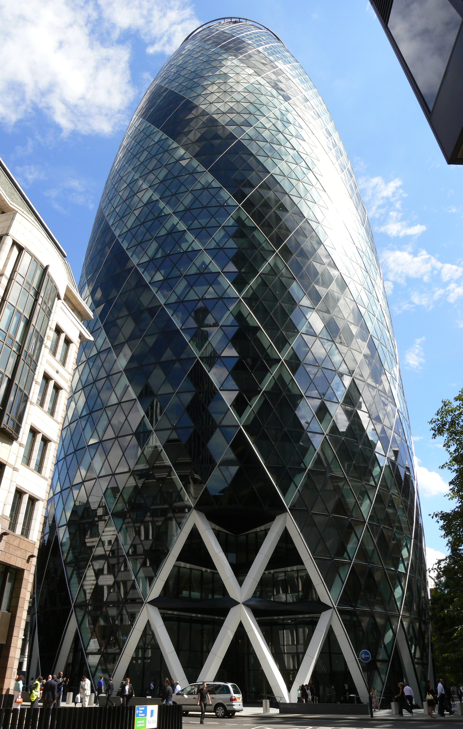
The office is well known for designing towers. One of the most successful towers the designed is the Swiss Re Tower in London from the year 2002, which is headquarters of an international insurance company. The tower is known for being very sustainable and using this air flow to pass the hot air through the building and take it out near the roof. The building uses diagrid and has oval shape and circular plan.

Swiss Re Tower  © Flickr- username: youflavio
    These idea of the diagrid was adopted by Norman Foster and his partners in a project for Hearst Tower in New York City completed in 2007. In this tower the architect uses diagrid or this diagonal structure which saves 20 percent of steel used for the building that not only makes the building more sustainable but also saves significant cost as the structure is one of the most expensive part of the building.

Hearst Tower  © Flickr- username: wallyg
The building was commissioned in the year 2001, right before the 9/11 and it was put on hold for some years after the 9/11 attacks in New York. The project for  the Hears Corporation was originally designed in 1926 in Art Deco style by Joseph Urban. The project was never completed originally, but even in the initial phases it envisioned a base with large tower above it. This is why the Landmarks Commission in New York approved the tower by Foster and Partners because it was already the idea that there would be a tower in this place.
Detail of the old facade  © Flickr- username: Antonio Viva
 The tower is located near Columbus circle on the corner of Central Park in New York City near Brodway in 8 Avenue. The project is near the Time Warner Center and also in the same avenue is the New York Times building by Renzo Piano. The differnce between this tower and the tower of Renzo Piano is that here the structure is exposed, is shown in the perimeter. Its in the same plane as the glass facade, while Renzo Piano separates and distinguishes what is the structure, what is the glass, and what are the metal rods that protect from the sun.
New York Times building  © Flickr- username: chapsRLZ
 The diagrid shape of the structure creates this unique feature in the corners of the building. Sometimes the window are facing down, sometimes the windows are facing up and they provide these unique views when one is in the interior and facing the outside. The building has some of the best views in New York City overseeing the Hudson River Park and Midtown Manhattan.
Diagrid structure of Hearst Tower  © Flickr- username: The PNG Scotts
The lobby of the building was designed by James Carpenter an architect and designer from New York City and has this waterfall which features water that go through the building and is used for evaporative cooling. The building is of the most sustainable buildings in the city: recycles its rain water, uses renewable energy and minimizes the use of air conditioning.

The Lobby of Hearst Tower  © Flickr- username:.HEI
The large lobby is an unique feature in the building, it is the place where the old building facade meets the new building. The two facades are separated and in the point of separation the architect designs a large glass facade, a big glass window in the upper part that allows the light to go through and to illuminate the public space that is right below it which is now use as a lobby and a as cafeteria.

Sliced Porosity Block II - A Conversation with Steven Holl


Friday, November 29, 2013

MIT Simmons Hall by Steven Holl

    Here we are at Simmons Hall, a building designed by Steven Holl, an architect based in New York. The building is part of a larger masterplan designed by Steven Holl for MIT which include a different educational and residential buildings. So far this is the only building build as part of this masterplan.

MIT Simmons Hall © Flickr- username: Adam Fagen
 The building hosts dorms for college students. It is inspired by the idea of porosity. Every floor has this public spaces, which are open to maybe three, four or five different levels that are accessible for students and they can use them either for studies area or for lounges where they can meet their friends.

Entrance Lobby © Flickr- username: Kyle Burrows
    Every level also has a balcony, which are these large cuts that you can see in the building, so you can either go to the indoor space of the so called caves on these very sculpture spaces in the interior, or you can on to the outdoor terrace and enjoy the views of Boston on one side or of Cambridge on the other side. Interestingly the structure of the building is in the facade so we don't have building in which he have separation of this facade and structure, but the structure itself is shown with this square grid that you see in the facade. So there are two lines of structure on the side of the corridor in the inside and then there are two structural lines right where the facade is.

Main Entrance © Flickr- username: jacqueline.poggi
     The facade is prefabricated as most of the project so the construction was easier, faster and cheaper. You can see the colours in the facade a blue, a red , orange and yellow. The colours express the structural stresses in the facade itself, so the more red we have the more structural stresses we have in that point and the more blue we have the less tension we have. So in a way its a building that shows us how it works, even if we don't see actual structures, even if we don't understand how the actual structure is designed, the colour in the facade tells us a story about it. Another interesting thing about this building is the idea of scale in the facade, as you can see is made of this square grid in which we don't really understand how many floors the building has as we look at it from the exterior. 

Mediation Room © Flickr- username: Kyle Burrows
     That idea of the scale is translated to into a different building by Steven Holl in Beijing where you have the slab that coin sides with the grid of the facade, so in that case it really tells us how many floors the building has. In this case is slightly ambiguous: we don't really understand the correspondence between the slab and the structure which creates this very interesting perception of the facade as we go closer to it and as we enter the building and see it from the interior. The building hosts also some public spaces on the ground floor. It has cinema, entertainment rooms, playgrounds and the dinning hall of MIT.

Skylight inside a cave © Flickr- username: Kyle Burrows
     Some times we have interesting moments when the caves go inside and actually alter the space of your room, so you may have a room wich is this octagonal plane and all of a sudden you have this curvilinear surface that goes inside and interrupts the space and creates these very unique special moments in the interior. Every floor, every room has three different windows on different heights, so you can see either up in the sky, or you can see down to the city, or down to the sports field. Students can personalize their room and furniture is modular, so you can assamble your bed in a different way, you can move your table in different way and you can really play with it, so its very creative and inspiring space.

Thursday, November 28, 2013

Jean-Louis Cohen: The Future of Architecture, Since 1889

In Madrid, another center of activity, the pivotal figure was Rafael Moneo. His critical writings and teaching also played a role beyond Spain, notably through his reflections on the permanence of architectural form, something exemplified, in his view, by the architectural palimpsest of the Great Mosque of Cordoba. His first large buildings had to do with the massiveness of their walls, continuing Kahn's legacy. They explored the resources of materials like brick, which he used to cover the simple volumes of the Bankinter in Madrid (1973-8) and the halls of the Museum of Roman Art in Merida (1980-6). The bays of the latter straddle the ancient ruins and shelter the archaeological pathway. Moneo also transformed infrastructure projects into authentic urban complexes: the Atocha Station in
Madrid (1984-92), built for the high-speed train to Seville, links clearly differentiated spaces and treats the station's most mundane components - parking lots, for instance - as architecture in their own right. At the San Pablo Airport in Seville (1987-92) Moneo provided a roof alluding to the Cordoba mosque. Together with city halls, museums have been among Moneo’s primary building types. He created original combinations of building envelope and natural lighting systems for the Miro Foundation in Palma de Mallorca (1987-92); the Davis Museum in Wellesley, Massachusetts (1989-93); and the Museum of Modern Art and Architecture in Stockholm (1998). The openness of his approach can be measured in his vastly different solutions for the Kursaal Cultural Center in San Sebastian (1990-9), a large lantern illuminating the Basque port that has come to represent the town much as Jorn Utzon's Opera House represents Sydney, and the Catholic cathedral in downtown Los Angeles (1996-2002), 544 an edifice infused with a spirit more Benedictine than Baroque and kept serenely bright by light falling through alabaster windows.

Tuesday, November 26, 2013

Kenneth Frampton: Towards a Critical Regionalism, 1983


Critical Regionalism is not so much a style as it is a critical category oriented towards certain common features, which may not always be present in the examples cited here. These features, or rather attitudes, may perhaps be best summarized as follows.
(1) Critical Regionalism has to be understood as a marginal practice, one which, while it is critical of modernization, nonetheless still refuses to abandon the emancipatory and progressive aspects of the modern architectural legacy. At the same time, Critical Regionalism's fragmentary and marginal nature serves to distance it both from normative optimization and from the naïve utopianism of the early Modern Movement. In contrast to the line that runs from Haussmann to Le Corbusier, it favors the small rather than the big plan.
(2) In this regard Critical Regionalism manifests itself as a consciously bounded architecture, one which rather than emphasizing the building as a free-standing object places the stress on the territory to be established by the structure erected on the site. This 'place-form' means that the architect must recognize the physical boundary of his work as a kind of temporal limit- the point at which the present act of building stops.
(3) Critical Regionalism favors the realization of architecture as a tectonic fact rather than the reduction of the built environment to a series of ill-assorted scenographic episodes.
(4) It may be claimed-that Critical Regionalism is regional to the degree that it invariably stresses certain site-specific factors, ranging from the topography, considered as a three-dimensional matrix into which the structure is fitted, to the varying play of local light across the structure. Light is invariably understood as the primary agent by which the volume and the tectonic value of the work are revealed. An articulate response to climatic conditions is a necessary corollary to this. Hence Critical Regionalism is opposed to the tendency of 'universal civilization' to optimize the use of air-conditioning, etc. It tends to treat all openings as delicate transitional zones with a capacity to respond to the specific conditions imposed by the site, the climate and the light.
(5) Critical Regionalism emphasizes the tactile as much as the visual. It is aware that the environment can be experienced in terms other than sight alone. It is sensitive to such complementary perceptions as varying levels of illumination, ambient sensations of heat, cold, humidity and air movement, varying aromas and sounds given off by different materials in different volumes, and even the varying sensations induced by floor finishes, which cause the body to experience involuntary changes in posture, gait, etc. It is opposed to the tendency in an age dominated by media to the replacement of experience by information.
(6) While opposed to the sentimental simulation of local vernacular, Critical Regionalism will, on occasion, insert reinterpreted vernacular elements as disjunctive episodes within the whole. It will moreover occasionally derive such elements from foreign sources. In other words it will endeavor to cultivate a contemporary place-oriented culture without becoming unduly hermetic, either at the level of formal reference or at the level of technology. In this regard, it tends towards the paradoxical creation of a regionally based 'world culture', almost as though this were a precondition for achieving a relevant form of contemporary practice.
(7) Critical Regionalism tends to flourish in those cultural interstices which in one way or another are able to escape the optimizing thrust of universal civilization. Its appearance suggests that the received notion of the dominant cultural center surrounded by dependent, dominated satellites is ultimately an inadequate model by which to assess the present state of modern architecture.

NEW - STYLE GLOBAL CULTURAL HUBS

     When, on 1609, Federico Borromoe established the Bibloteca Ambrosiana, for the first time, a cultural instituion opened its doors to the public, enabling not just the consultation of books and manuscripts but also the use of  "paper, pen and ink", as witnessed by the Italian novelist Alessandro Manzoni.
     Since than, four centuries have passed, and the world of culture has changed utterly, especially in recent decades. In past centuries, libraries theatres and museums formed largely autonomous entities, in which different forms of knowledge were studied and developed without, however, engaging in direct confrontation. Today, the sector has undergone a radical change , creating and perfecting new hubs in which the different media of culture intersect and engage in a constructive exchange. This has led to the development of great museum complexes, in which permanent exhibitions spaces are flanked by areas for temporary exhibitions, sector-related specialist libraries, and halls dedicated to music, seminars, debates and presentations. Furthermore, technology features strongly, providing adequate solutions for these complex projects.

Pompidou Centre © Flickr- username: Andrew Bowden
     An undoubtedly emblematic starting point for this new type of museum is the Pompidou Centre in Paris, designed by Richard Rogers and Renzo Piano specifically as an interdisciplinary structure, synthesis of an innovative and far sighted political strategy and of advanced technological research. These have led, also on a perceptual level, to the creation of remarkable "cultural system" in the heart of the Parisian urban fabric.
     Since it opened in 1997, much has been said about this form of architecture and its functionality, but certainly no one can deny its role as a prototype for a long series of buildings around the world, similar in function and increasingly articulated. Indeed, every subsequent example has added something new and different. Without moving beyond the confines of the city of Paris, if we take a look at the Musée D'Orsay, inagurated in 1986, we can see that herer the "cultural system" has gone so as to take over what onnce a railway station, in which the exhibition spaces unfold under the large glass vaults that once covered the rail tracks.
     The aim is not to erase the past, but to bring it in line with modern functions. This new way of producing and offering culture is expanding fast. To quote another Europian example, London too has looked to a historical service related building for another important "culture system". In this case, a power station, built in the fifties and later decommissioned, was recovered and transformed by Herzog and de Meuron, into a large museum complex and contemporary art: the Tate Modern (2000). Freed of its machinery, the building has preserved its enormous Turbine Hall, in which from time to time huge sculptures and installations are displayed, offering artistic effects on a macro-scale. The large parallelepiped building, marked by a high chimney at its center, has been emptied of its technical equipment to give way to exhibition spaces, service facilities, libraries and meeting places. Its posiiton overlooking the River Thames accentuates its relationship with the city, not just for the breathtaking views from the upper floors, but also through its link with the other side of the river via the pedestrian bridge, foreshortening its distance from the city. The builng is now expanding further to accommodate new features.
Tate Modern © Flickr- username: m.a.r.c.
     Another museum complex that is worth mentioning for its strong historical and political significance, both past and present, for its architecture, and for the high quality of its modernisation interventions, is the Museum Island in Berlin, a complex of buildings designed in nineteenth century to house collections from successive artistic eras, from ancient times to the contemporary art of the time.
    Each of the five factories comprising the site was conceived by its designers as a strong and symbolic expression of german neoclassicism: from the Altes Museum, designed between 1822 and 1830 by K.F. Schinkel to house the collection of antiques of Frederick William III, to the Neues Museum, built by F.A. Stùler in 1855 and severely damaged during World War II, from the Alte Nationalgalerie, created to house the works od nineteenth century Germany, to the Bode Museum, created in !907 to display art from the Byzantine period and from late antiquity. Last but not least is the Pergamon Museum, (1930), home to important classical antiquities, including the Pergamon Altar.
     The reason for mentioning the Museum Island in this context is the extensive renovation project conducted following the fall of the Berlin Wall. Having been heavily damaged bby bombing, the complex had been abandoned and the works of art divided between the two parts of the city. Only the Pergamon Museum had remained as a cultural attraction. Following the reunification of Germany, by popular and political acclaim - the same that led to the demolishment of the nearby parliament building of the former German Democratic Republic - work commenced on each of the five museums, with a view to restoring them to their original vocation. The momentum was such that work was rapidly completed, with successful restoration and fitting-out interventions. Particularly worthy of note is the masterly restoration of the Neues Museum, conducted by David Chipperfield and concluded in 2009. The architect not only managed to preserve and surviving walls, columns and fragments of plaster, but also to restore and enhance the original atmosphere, through the expert use of materials and impressive perspectives on particale works of art. Overall, the complex was transformed into a modern museum centre, harmonious in its diversity, bearing witness to a past that inspired UNESCO to declare it a World Heritage Site in 1999.
   
Neues Museum © Flickr- username: t1m0b
A similar process of creating new and innovative cultural spaces has, in recent years, seen the involvement of the world of music, once tied to traditional theatres in which the hall constituted the fundamental space of the building.
     Today, this sector has undergone a great transformation giving rise to complexes housing many functions alongside the musical element. It is on the wave of these developments that in 2002 Renzo Piano developed his Parco della Musica in Rome, which reinterprets traditional feature to create a series of halls, great symphonic events and rock concerts find a venue equally suitable for their particular requirements. Ate the same time, other cultural elements find space to coexist: recording studios, rehearsal halls, shopping areas, meeting points and strolling areas, as well as a museum, a library and a music archive. The large outdoor auditorium can accommodate up to 3000 spectators. Even more emblematic, in that it brings together art, science and industry, is the Parc de la Villete, a large technology park on the outskirts of Paris. Here, the most diverse functions have gradually been established since the mid-eighties.
     In addition to green areas, thereis the Citè des Sciences et des Industries, inaugurated in 1986, a parallelepiped-shaped complex covered by two transparent domes, making this the largest technical and scientific museum in Europe.
     Nearby is the Citè de la Musique, with a Conservatory, a Music Museum and an elliptical concert hall, designed by Christian de Portzamparc "comme une suite musicale. C'est là, dans cette expèrience du mouvement, des enchainements, des surprises, que l'architecture rejoint la musique." The site is currently being expanded with the Philharmonie, anouther music venue, this time designed by Jean Nouvel.
     In short, we can observe that, as museum has become an area of artistic enrichment, socialisation and leisure, so, in the world of music, the harsh theatre, has been replaced by complex structures in which the concept of culture is becoming increasingly universal. Modern man not only strives to bring together the various worlds and venues of knowledge, but unites them with moments of socilisation, entertainment and internationality, bearing witness to the globalization of art.

Sendai Mediatheque - Toyo Ito

Me qellimin per te dizenjuar nje qender multimediale kulturore te tejdukshme e cila mbeshtetet mbi nje sistem unik qe lejon nje pamje te plote dhe transparente ne ambientin perreth komunitet, qendra Mediateka Sendai e projektuar nga Toyo Ito eshte nje veper revolucionare ne teknologjine e perdorur dhe estetiken e saj.

© Flickr- username: yusunkwon
Gjashte tuba te nderthurur prej celiku, secili 40 cm i gjere, shfaqen sikur londron mbi rruge, te mbajtur lart nga vetem 13 kollona vertikale dhe kto prej celiku te punuara ne forme te degezuar qe zgjatohen nga kati perdhe deri ne tarrace. Kjo cilesi e larte shikueshmerie qe eshte dhe karakteristike e dallueshme e projektit ne fjale eshte e krahasueshme me pemet e larte ne nje pylle ku drita kalon ne forme rrezesh por nga ana tjeter ajo krijon nje ambient homogjen per te gjitha funksionet, rrjetin e sherbimeve dhe sistemet.

© Flickr- username: scarletgreen
Cdo kate eshte i lire ne hapesire pasi kollonat sktrukturale jane te pavaruara nga fasada dhe variojne ne diameter sepse ngushtohen duke kaluar nga kati ne kate. Qellimet e thjeshta per tu perqendruar ne plane (dyshemet), cilindra (kollonat), dhe siperfaqja e holle (fasada e jashtme) lejojne nje vizatim poetik dhe terhqes, si dhe nje sistem kompleks aktivitetesh informuese.

© Flickr- username: scarletgreen
Kater tubat me te gjere jane vendosur ne cepat e struktures dhe sherbejne per te mbajtur ngarkesen e nderteses. Pese nga nente tubat e tjere me te vegjel jane te drejte dhe permbajne ashensore, ndersa 4 te tjere jane te perdredhur dhe permbajne sistemet e aspirimit, kondicioneret dhe instalimet elektrike.
Ndersa hyn ne Mediateken Sendai, publiku drejtohet nga vazhdimesia e qyteti ne hapsiren me lartesi te dyfishuar te hollit kryesor nepermjet portalit te fletava prej xhami. Ky katror i hapur perfshin nje kafe, nje dyqan te vogel dhe hapsire komuniteti qe eshte e afte te projektoj fima dhe evente te tjera.

© Flickr- username: scarletgreen
Nje tjeter kendveshtrim unik i kesaj ndertese eshte perfshirja ne te e shume dizenjuesve te cilet kane punuar ne cdo kat te saj. Kazuyo Sejima ka vizatuar katin perdhe, duke vendosur zyrat administrative mbrapa nje perdeje xhami opak. Libraria Shimin e ndoshur ne katin e dyte dhe te trete permban nje sallon kerkimi i kompletuar me internet dhe i dizenjuar posacerishit nga K.T. Architecture.

© Flickr- username: yusunkwon
Hapsira e galerise ne katin e katert dhe te peste permbajn nje vendodhje per ekspozite me mure te levizshme, si dhe nje vend me i qendrueshem me mure te ngurta dhe nje pjese pushimi me vende per tu ulur te dizenjuar nga Karim Rashid. Ross Lovergrove mori pergjegjsine e katit te 6 duke shtuar nje kinema me 180 vende dhe mobilim jeshil me te bardhe qe shkon me se mire me librarine audio-visuale multimediale.

© Flickr- username: yisris
Ngjashmeria e kollonave te celikut me deget e pemeve eshte ne vazhdimesi me rrethimin natyral te vend-ndodhjes, sepse ky motiv gjendet ne rrugen me peme te rreshtuara. Ndertesa ndryshon gjate stineve, gjate veres reflekton jeshilen e pemve ndersa gjate dimrit reflekton asfaltin e rrugeve.

Sunday, November 24, 2013

Kush eshte Frank Lloyd Wright ?

Qershor 8, 1867 – Prill 9, 1959
Richland, Wiskonsin, Sh.B.A
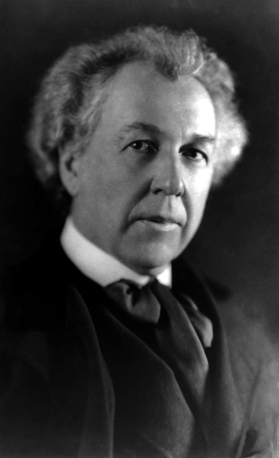
Frank Lloyd Wright ka qene nje arkitekt amerikan, nga me te shquarit e shekullit te 20.

Sebashku me Le Corbusier, Walter Grupios, Ludwig Mies van der Rohe dhe Alvar Aalto konsiderohet nje nga mjeshtrat e Levizjes Moderne ne arkitekture. Ne 2011, Presidenti i Shteteve te Bashkuara te Amerikes Barack Obama shprehu deshiren e shtetit amerikan per te paraqitur perprara UNESCO-s kanditaturen e veprave te Frank Lloyd Wright si Trashegimia Boterore e Njerezimit.
Romantikisht i lidhur me ideologjine individuale te "Vullnetarizmit" amerikan, ai u hodh ne thellimin e studimit te raportit te individit me hapsiren arkitekturore dhe te ketij te fundit me natyren, e perdorur si referim themelor ne paraqitjen e jashtme. Ky interesim i tij e ben qe te favorizoje temen e shtepise mono-familjare e quajtur "praire houses", qe do te perbente fushen percaktuese te tij ne periudhen e pare te aktivitetit te tij si arkitekt. Konsiderohet gjithashtu si nje nga eksponentet me te medhenj te rrymes organike ne fushen e arkitektures kontemporane.Ne shkrimin e tij Arkitektura organike i vitit 1939 Frank Lloyd Wright shpreh plotesisht idene e tij mbi arkitekturen, qe ka si ide kryesore refuzimin e kerkimit thjeshte te esteties ose shijes siperfaqesore, ne te njejten menyre si shoqeria organike duhet te jete e pavarur nga cdo shtyse e jashtme e kundert me naturen e njeriut. Projektimi arkitektonik duhet te krijoje nje harmoni te njeriut me natyren, duhet te krijoje nje sistem te ekuilibruar midis ambientit te ndertuar dhe ambientit natyror nepermjet nderthurjes se elementeve te ndryshem artificial te krijuar nga njeriu ( ndertesa, mobilje, etj.) dhe elementeve natyrore qe rrethojne vendin ku do ndertohet. Gjithcka behet pjese e nje organizmi te unik te nderlidhur , nje hapsire arkitektonike. Shtepia mbi ujvare ( Fallingwater House ) e vitit 1936 eshte shembulli me i perpikte dhe i paperseritshem i kesaj menyre "alla Wright" i te berit dhe te kuptuarit te arkitektures. Keshtu do te shprehej Wright mbi arkitekturen organike :" Me Arkitekture Organike une kuptoj arkitekturen qe zhvillohet nga brendia drejt se jashtmes, ne harmoni me kushtet e qenies se saj, e dallueshme nga projektimi qe mund ti behej nga jashte. "

Te perkufizosh arkitekturen...

 Arkitektura eshte disiplina qe ka per qellim organizimin e hapsires ne cdo shkalle madhesie , por kryesisht te shkalles ne te cilen jeton qenia njerezore. Per ta thjeshtuar konceptin mund te thuhet qe arkitektura bazohet kryesisht ne projektimin dhe ndertimin te nje objekti te palevizshem ose ambientit te konstruksionit.